
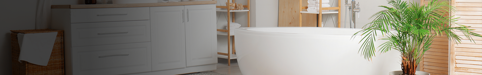

Choosing the right cabinets and countertops might seem simple until you see them side by side in your own kitchen. Suddenly, what looked perfect under showroom lights feels off at home. The colours don’t work together, and the room doesn’t feel as polished as you imagined.
Most of the time, it’s not the material or finish that’s wrong; it’s the tone. A cool-toned counter paired with warm cabinets can clash in ways that are hard to ignore. Even subtle mismatches in undertone can throw the whole design off and make the space feel unbalanced.
Keep reading to learn how Vaughan homeowners are making smart tone choices with quartz countertops.
What Are Warm and Cool Tones—and Why They Matter in Kitchen Design
Every colour leans warm or cool. Warm tones feel earthy and rich; cool tones feel crisp and modern. It sounds basic, but it’s what sets the mood in your kitchen.
Your cabinets, counters, lighting, and even flooring all carry tone. When tones don’t match or complement each other, your whole kitchen can feel disjointed. But when they’re in sync, the space feels intentional.
The tricky part is that tones can shift. What looks neutral under warm lighting might suddenly feel too yellow in the morning sun. That’s why it’s not enough to just like a sample; you need to understand how it fits with what you already have.
Matching cabinets and countertops by tone brings visual balance. It keeps the eye moving smoothly and creates a space that feels pulled together.
Homeowners often get stuck when they try to mix styles without thinking about tone. For example, pairing modern grey cabinets with a warmer countertop with yellow undertones can look slightly “off,” even if both finishes are beautiful on their own. The opposite is true as well: warm cherry cabinets with a cool bluish-grey surface may feel disconnected.
Before committing to a colour, it helps to lay out samples under different lighting conditions. View them next to cabinet swatches, paint chips, and even flooring. Tone matching is more than a visual choice; it’s a feeling of unity.
Choosing Quartz Countertops Vaughan Homeowners Love: Understanding Your Colour Options

Quartz is often chosen for its colour consistency. Unlike the granite countertops found in many Vaughan homes, quartz won’t surprise you with unexpected veining or colour shifts. That makes it easier to match by tone.
Some quartz colours lean cool with grey or soft charcoal tones, while others have warm beige, taupe, or creamy undertones. The key is identifying the base tone before trying to pair it with cabinetry.
You’ll find plenty of cool-toned options in quartz countertop stores in Vaughan. These work well with white or grey cabinets. But if you’re dealing with warm wood tones like walnut or cherry, a warmer quartz surface can help maintain harmony.
The advantage of quartz is its flexibility. You’re not stuck with the limited natural patterns often seen in marble countertops available across Vaughan. That freedom makes tone matching much more straightforward.
It’s also worth noting that many countertop stores carry slab samples that reflect under different lighting. This helps you see how the tone behaves in natural and artificial light, something you don’t always get when browsing online.
Another useful tip is to look for quartz with subtle patterns rather than bold ones. Subtle veining or flecks can offer just enough variation to add character without pulling your eye away from the overall design. This is especially important if you’re going for tone-on-tone combinations, which rely more on depth than contrast.
How to Pair Cabinet Colours with Warm or Cool Quartz Countertops

Before choosing a countertop, take a close look at your cabinets. Are they warm, cool, or neutral? The answer will guide every other design decision.
Cool Cabinets with Cool Quartz
Pairing like with like keeps the look calm. If you have white or soft grey cabinets, go for a countertop that carries a similar undertone. This works well in modern or minimalist spaces.
Cool-on-cool combinations can sometimes feel flat, so bring in texture or contrast through your backsplash, hardware, or flooring. Brushed nickel handles or matte black faucets can add dimension without clashing.
Using quartz countertops in Vaughan kitchens with this kind of cabinet setup creates a clean and polished appearance that appeals to many buyers.
Warm Cabinets with Cool Quartz
This mix can work beautifully if done with purpose. Honey-toned cabinets paired with clean, cool quartz can make the space feel fresh and updated.
Just be sure the contrast feels deliberate. Add a neutral wall colour or a backsplash that echoes both tones to tie everything together. You don’t want the cabinets and counters to fight for attention.
Here are a few tips to make it work:
- Choose a backsplash that blends both tones.
- Add warm metallic accents like bronze or brass to bridge the difference.
- Use natural elements like wood shelves or cutting boards to soften the transition.
Warm Cabinets with Warm Quartz
If your goal is warmth and comfort, this is a safe bet. Think of maple cabinets with creamy quartz or walnut with soft brown tones.
This style leans traditional but can still feel current with the right lighting and fixtures. It works well in family homes, especially when paired with warmer flooring like oak or hickory.
Use lighting to maintain the mood. Avoid bright daylight bulbs as these can wash out warm tones. Instead, go for soft white or warm LEDs to keep the atmosphere cozy.
Tone-on-Tone Matching
Pairing cabinets and countertops in the same tone family keeps the look quiet and unified. This works well in open-plan spaces where you don’t want the kitchen to dominate.
Just vary the texture, finish, or depth of colour slightly so the room doesn’t feel too flat. For example, matte cabinets and glossy counters create a nice mix, even if they’re in the same colour range.
Many homeowners looking for quartz countertops in Vaughan lean toward tone-on-tone because it feels timeless and easy to live with.
Final Tips for a Balanced Kitchen Design That Goes Beyond Cabinets and Countertops
Getting your cabinet and countertop tones to work together is a great start, but the rest of the space matters just as much. These final tips will help you make sure everything around those two surfaces supports the look you’re going for.
1. Use Wall Colour as a Bridge
If your cabinets and countertops come from opposite tone families, a well-chosen wall colour can pull everything together. Soft neutrals like beige or off-white don’t steal attention, but they smooth out the transitions. It’s often the simplest fix when things feel just slightly off but not completely wrong.
2. Think About Lighting Early
Lighting can shift the way colours appear in a big way. Cool lighting tends to bring out greys, blacks, and crisp whites, while warm lighting enhances beige, taupe, and cream tones. That’s why it’s important to test your quartz sample under the same type of lighting you have in your kitchen, both during the day and at night.
3. Choose Backsplash Materials That Complement, Not Compete
The backsplash is your connecting piece between cabinets and countertops. Pick a material that shares a tone or texture with both. If you’ve gone high-contrast with your main surfaces, the backsplash can act as a soft middle ground. Avoid anything too bold unless the rest of the space is very simple.
4. Don’t Overlook Hardware Finishes
Handles, knobs, and faucets may seem like small details, but they can support your tone story in a big way. Brushed nickel suits cooler tones, while brass or bronze warms things up. Pick finishes that align with your countertop and cabinet tones, or choose a neutral metal that blends quietly.
5. Look at Everything Together, Not in Isolation
One of the biggest design mistakes is choosing each element separately. Bring samples of your cabinets, countertops, wall paint, and flooring into the same space. Check them together, both in daylight and under artificial light. Tone matching works best when you look at the whole picture, not just one part.
Matching cabinet colours with the right countertop tone isn’t about following rules. It’s about finding what looks and feels right in your space. With everything from concrete-look surfaces to dramatic black veining, the variety of quartz countertops available in Vaughan makes it easier to find a tone that suits your kitchen style. If you’re looking for dependable options without the guesswork, Home Care Supply has a curated selection ready for you to explore.


